Zacksite History
The Beginning ...
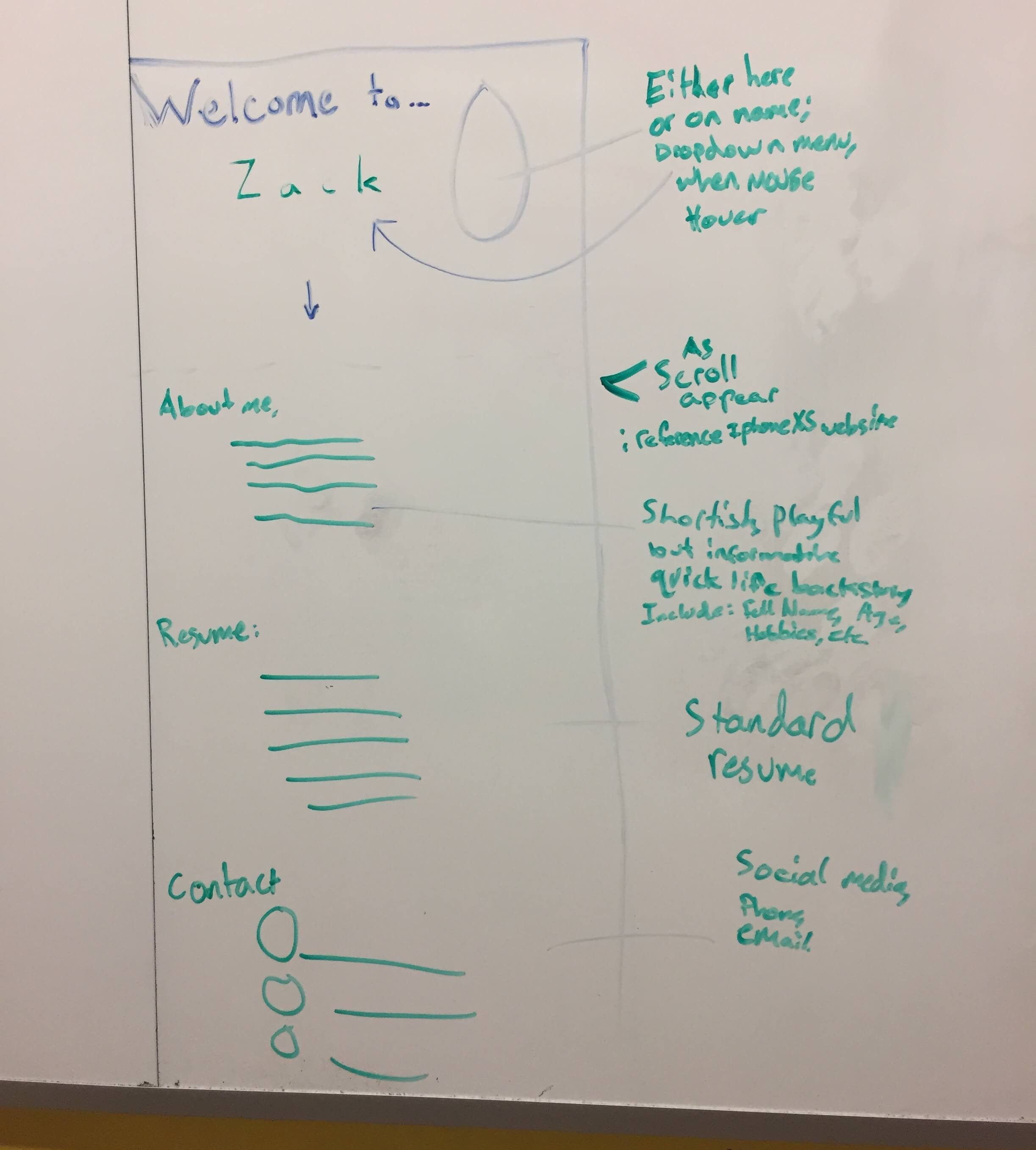
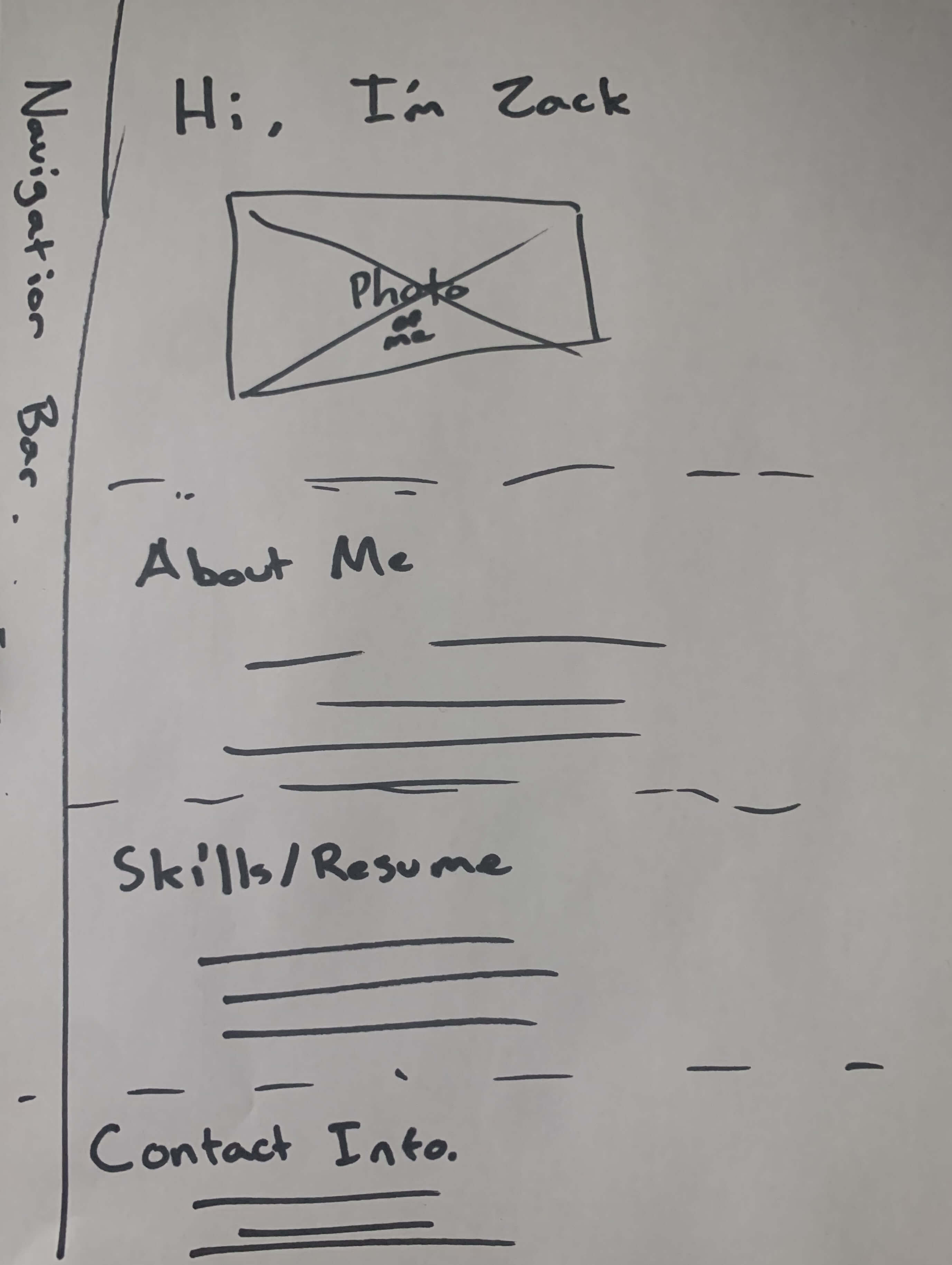
It all started a few years ago with nothing but an idea and a drawing. I was just a sophomore trying to study in the library when I got sidetracked and started sketching. I knew that I wanted to make a personal website and despite not knowing how to code at all, I still designed and planned out the first iteration. That summer I decided I would learn how to code, so that this idea could become a reality. I watched youtube videos, took notes, looked at the code behind popular websites I liked, and completed a course on Codecademy. By my junior year, I was able to read and write html code. Unfortunately, that wasn't enough.
Zacksite 1.0
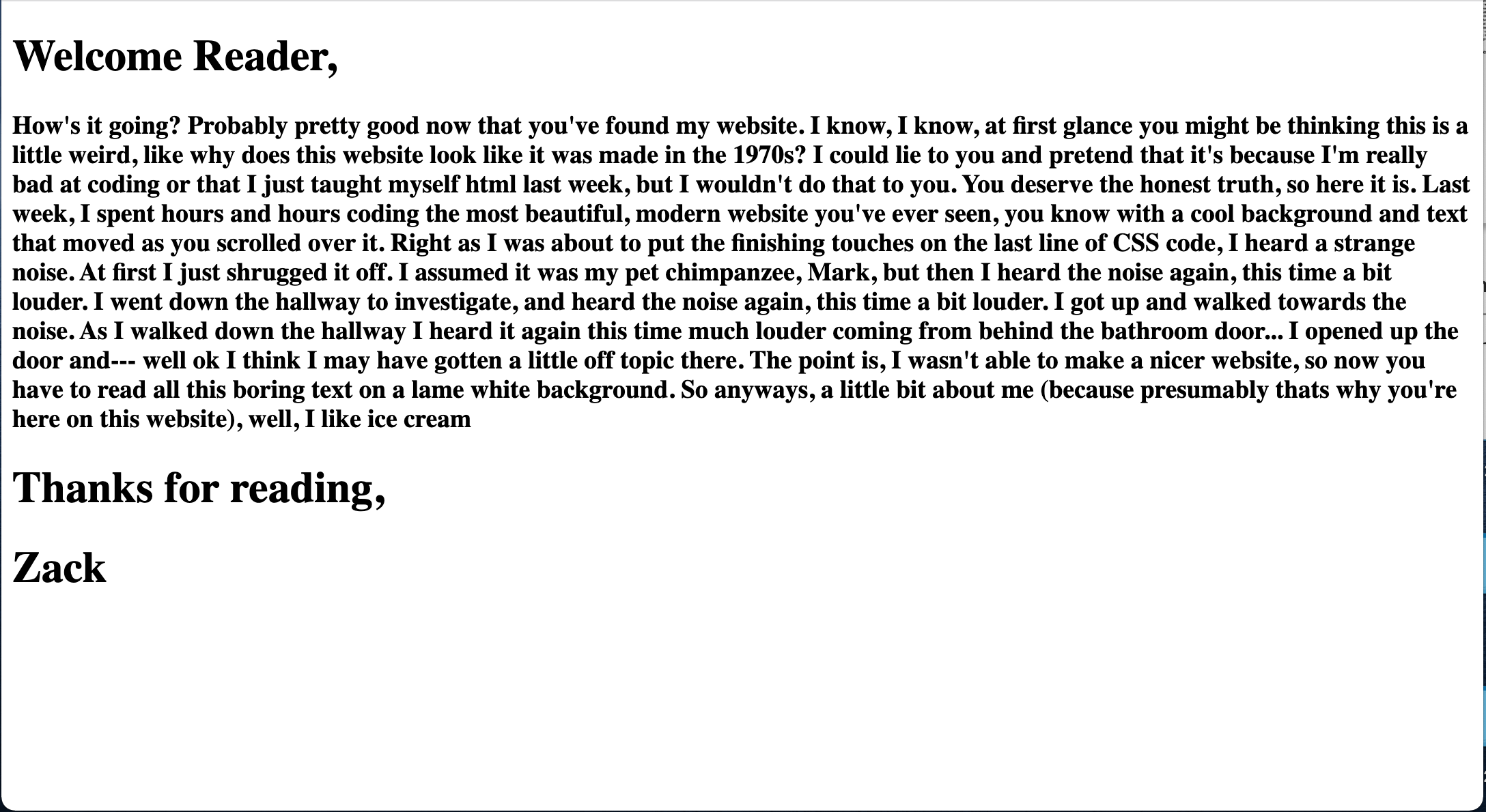
It turns out, just knowing a bit of html is not enough to make a very interesting website. That brings us to Zacksite 1.0. Despite not having the skills necessary, I still was quite determined to have my own website. One night I decided to just go for it and quickly drafted up a paragraph or two, and formatted it into html. It wasn't my end goal, but it would serve as a placeholder as I went back to the drawing board and learned CSS.
Zacksite 2.0
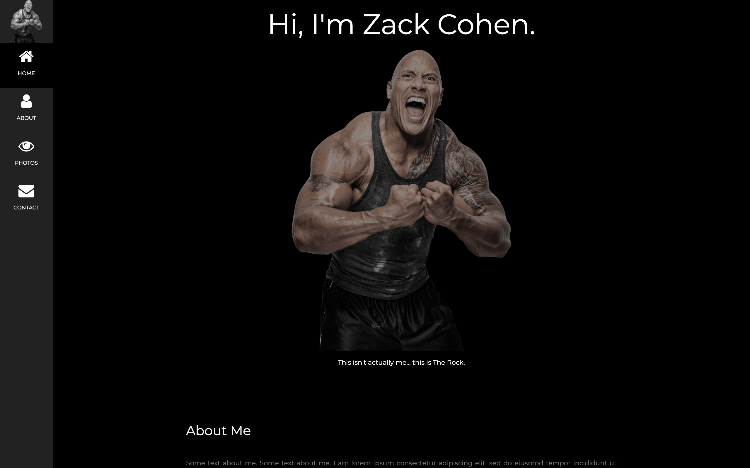
While I was trying to teach myself CSS I stumbled on to a website called W3 Schools. This website was extremely helpful in breaking down all of the CSS elements and how to use them. It also provided a few templates that I ended up using. I took one that I liked and modified it to follow an idea I had been thinking about for a while, which was to make a joke about me not being The Rock. After working on this site for a little while, I decided that it was not what I wanted and ended up moving on from it. The main reasons for this were because I had some other ideas I wanted to try, I wasn't really finding the Rock joke to be that funny anymore, and I felt too boxed in by the template design that I was using. This led me to the next design; Zacksite 3.0.
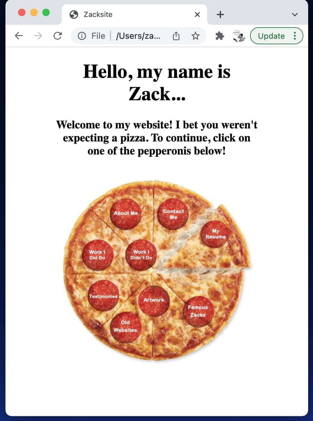
Zacksite 3.0/4.0
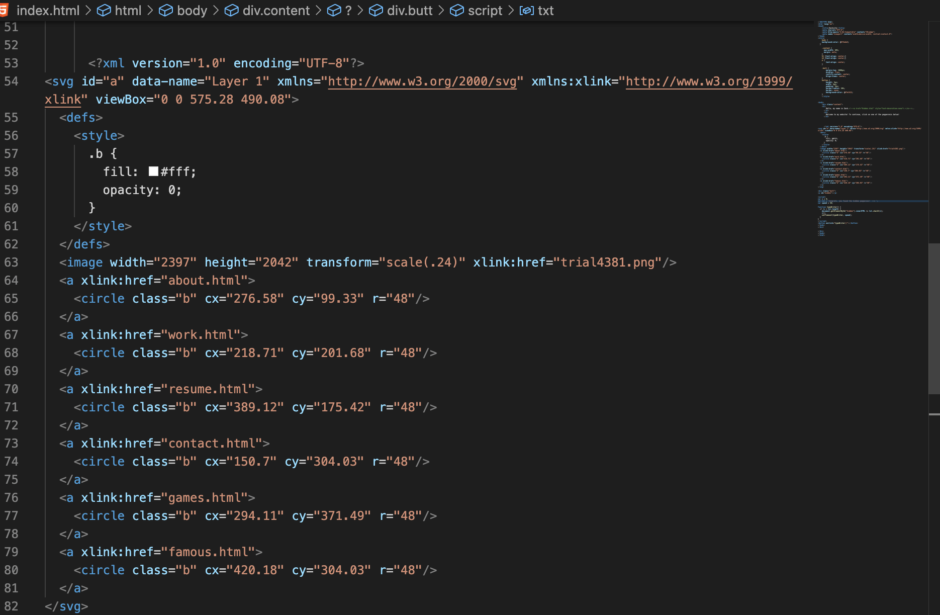
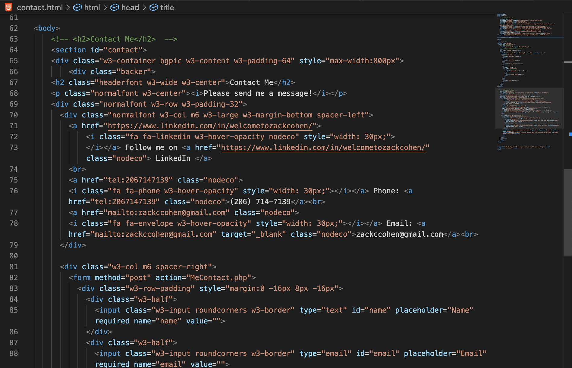
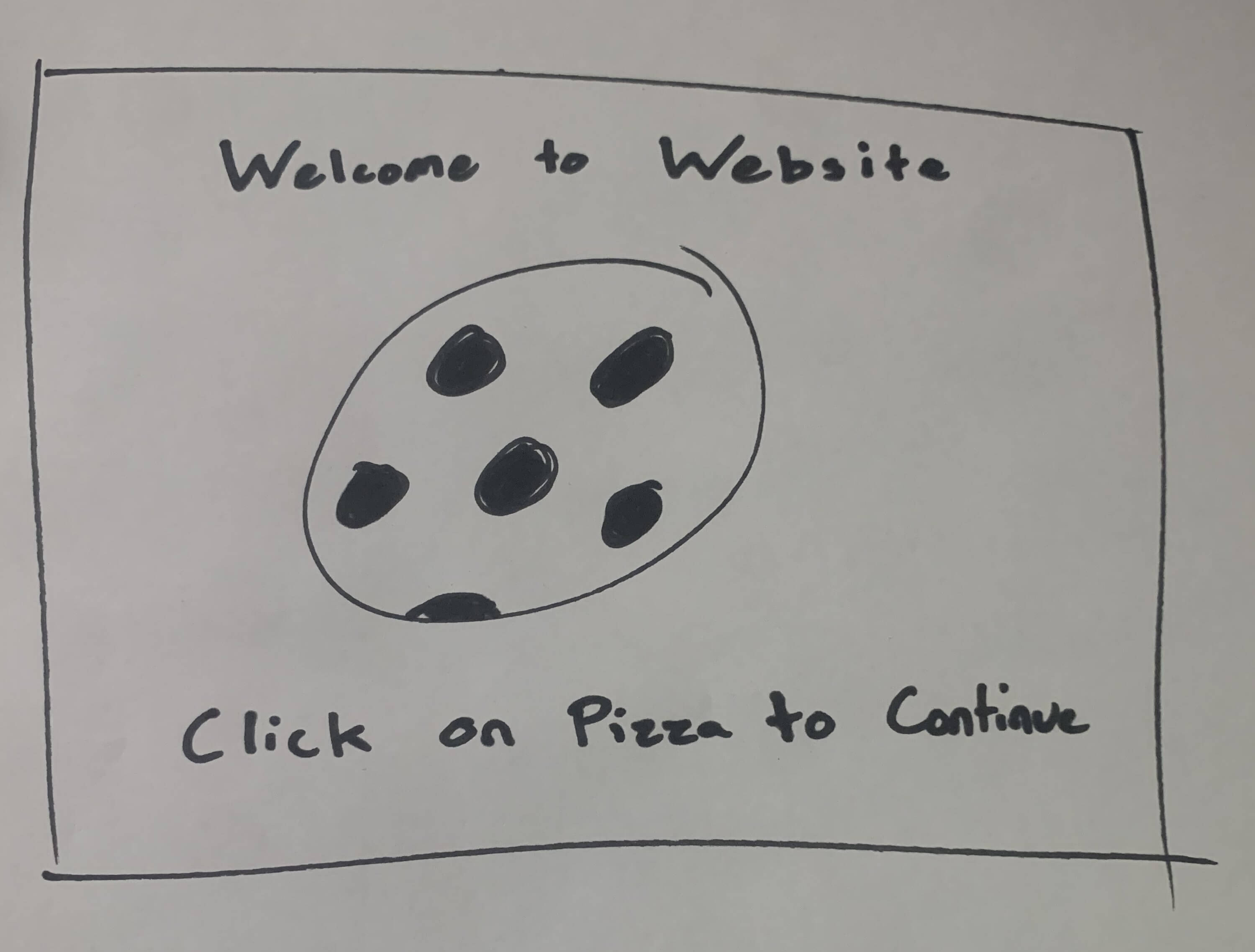
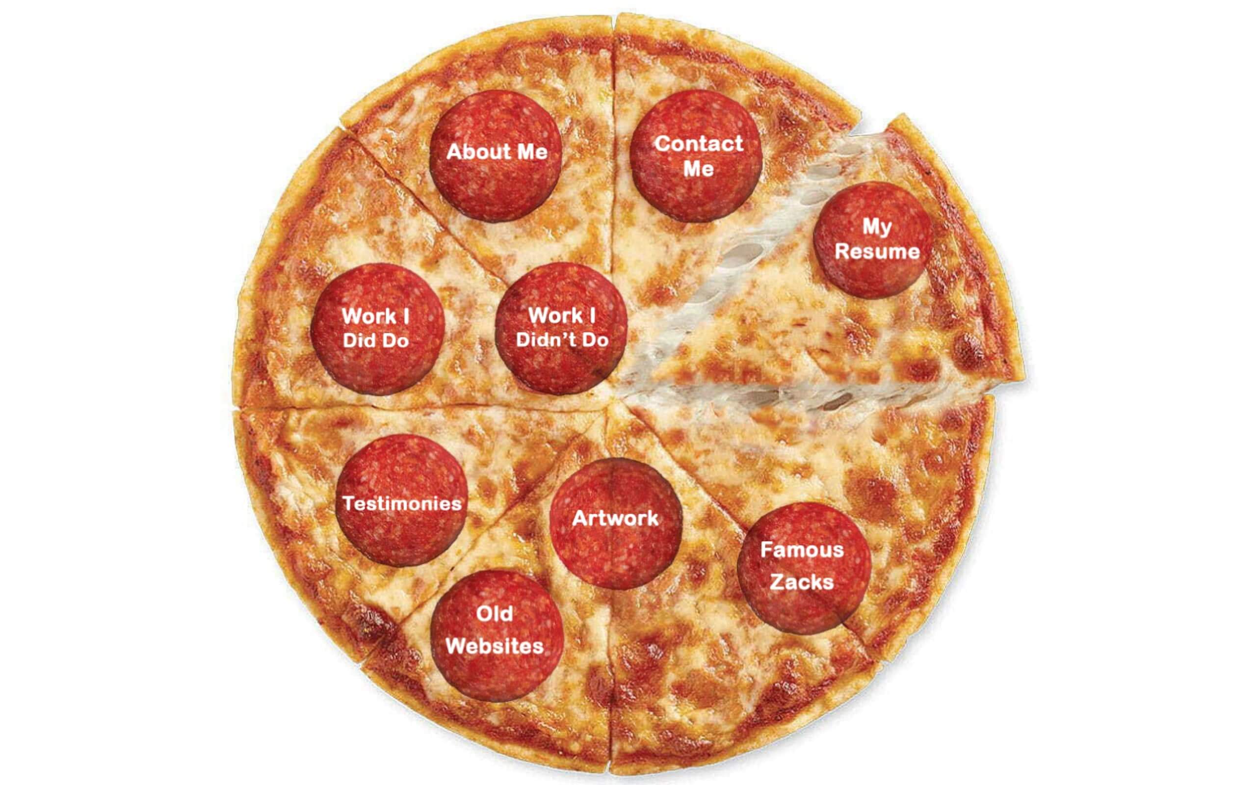
Here we are, the pizza themed website. I'm not sure what prompted it, but one day I had the idea to make the home page of my website feature a pizza that facilitated user navigation. Unfortunately, there were no templates out there that could help me accomplish this. So, once again, I sat back down and started learning. I learned a lot more about CSS and realized that I could probably pull this off. I searched for a solution for a while and eventually I learned about Image Maps and how to map out clickable areas in an image. Unfortunately, after setting this up, I realized that image maps aren't responsive. This means that the pizza wouldn't resize based on the browser size and couldn't be used on a mobile device. I tried a bunch of different CSS tricks to get around this, but none of them worked without messing up the map. I even tried some javascript ideas that I found on Stack Overflow, but couldn't get those to work either. Eventually I found a solution that worked. I recreated my image map in Adobe Illustrator and turned the whole thing into an SVG (scalable vector graphic) map with x-links set in the image metadata. This made my design scalable and helped me create the home page you see now.
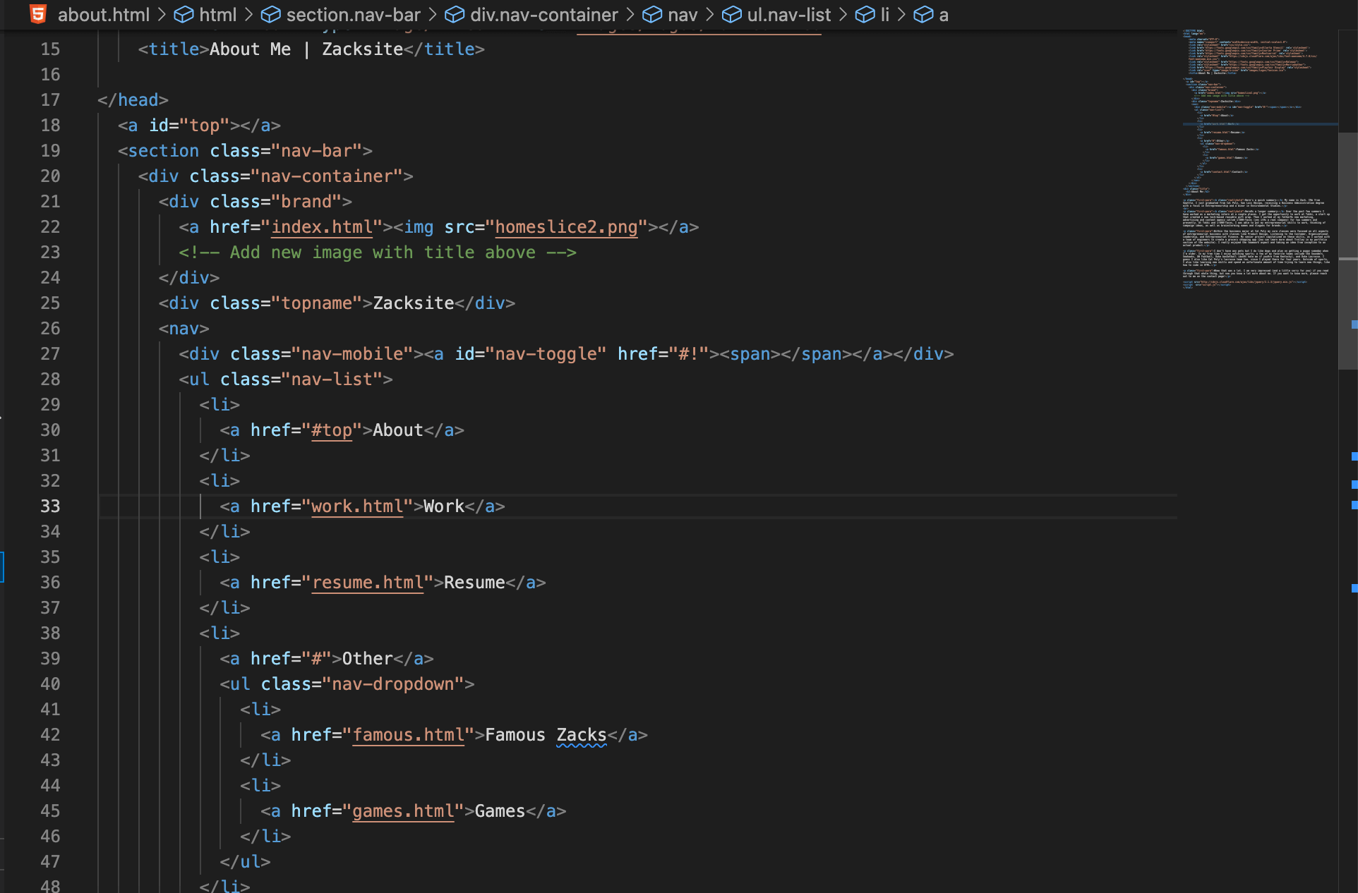
While working on version 3.0 I turned back to CSS templates to help guide me on creating the other pages. Eventually I had to get hosting so that I could publish my website and ended up going with a service called Bluehost. While I was uploading my site, I saw that I got free wordpress access through Bluehost. I decided to scrap my current portfolio page that I had designed freehand, and opted to use a portfolio wordpress theme. While in the end this was simpler than coding my own site, it took me a lot of time to fully understand how to use and customize wordpress to get my pages where I wanted them.
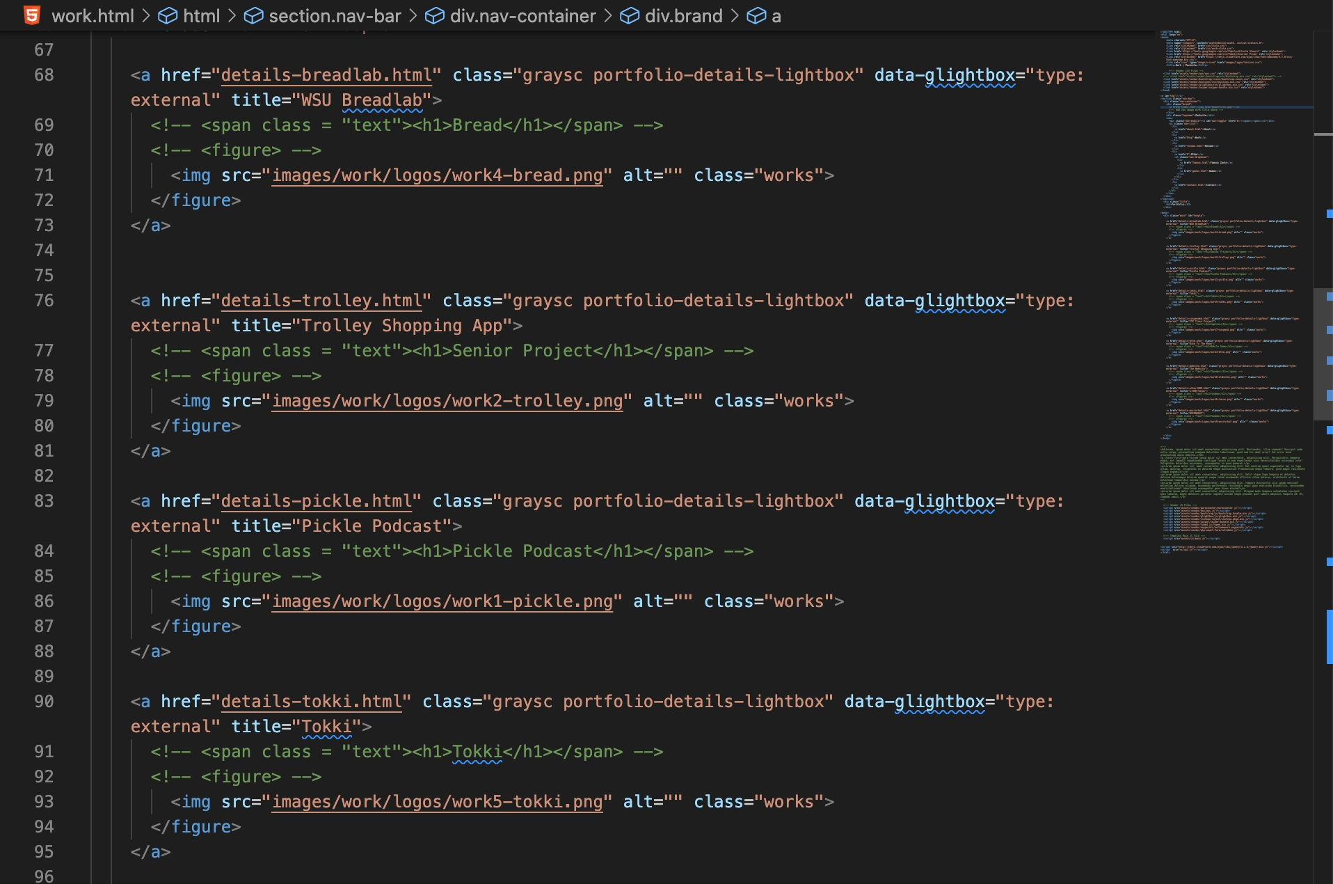
This is where version 4.0 comes in. After finishing 3.0 I showed it to my dad and got the response "It's great but... there's way too much going on". He was completely right. With the mix of all the templates and random things I added in, the site had become weird and confusing. As painful as it was, I scrapped it and started over again. I kept 6 of the pepperonis, doubled down on learning CSS and avoided using templates (except for the resume... oops), and kept every page under the same theme. 16000 lines of code later, it is finally complete.
Despite spending wayyyy too much time building this, I am proud of where I have gotten and hope that you have enjoyed browsing the site. Sorry if you read all of this, I know it's been quite a long write up and I don't think I am going to go back and spell check it.
Thanks for reading,
Zack
Bibliography
- W3 Schools
- Stack Overflow
- Flipcards
- Bluehost
- Contact Form PHP file
- Grid Layout Tutorial
- SEO Tips
- Header Tutorial
- Codecademy
- Youtube Tutorials
- WikiHow
- SVG Image Map
- Speed Test
- Image Optimization
- All the Games
- Flappy Bird
- Contact Form PHP Test
- Webp Image Optimizer
- Changing Highlight Color
- How I've Tested and Optimized The Site
Code Screenshots